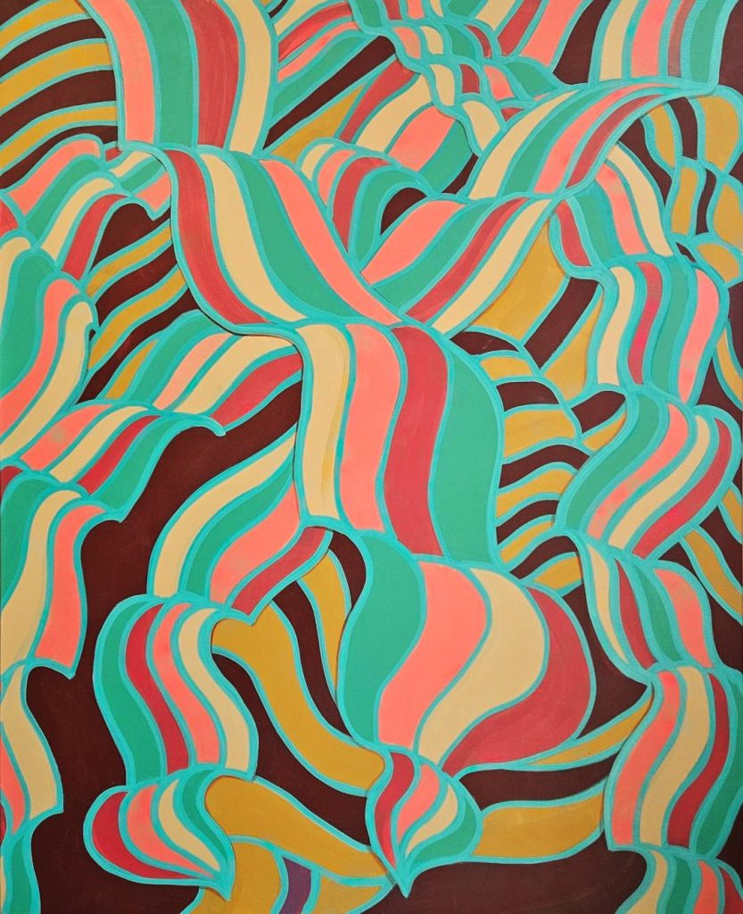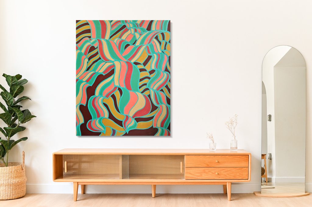

48 x 60 in | Mixed Media on Canvas
Joy Melt unfolds through a rhythmic layering process that feels both deliberate and intuitive. The composition appears to begin with a network of fluid, looping forms, mapped out like interlacing ribbons that weave across the entire surface. These contours act as both structure and constraint, creating compartments that hold color while also guiding the viewer’s eye in continuous motion. The lines themselves—painted in a vivid turquoise—serve as a unifying framework, separating and simultaneously connecting each section. The repetition of these sinuous shapes suggests a process of building and revisiting, where gestures are refined, echoed, and expanded until the surface feels saturated with movement.
The color palette is central to the painting’s energy, balancing warm and cool tones in a way that feels buoyant and immersive. Bright corals and soft pinks pulse against cooler teals and aquas, while creamy off-whites and muted golden ochres provide moments of rest and contrast. Beneath and between these colors, deep maroon and near-black passages create depth, allowing the brighter hues to vibrate more intensely. The interplay between opaque and flatly applied color fields and the darker negative spaces gives the painting a sense of dimensional push and pull, as though the forms are simultaneously melting into and rising above the surface. Overall, the palette reinforces the title—suggesting warmth, sweetness, and a kind of joyful dissolution where color and form soften into one another.
View the entire process here.